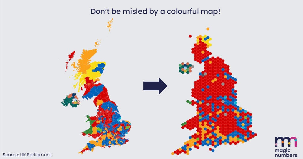
Don’t be misled by a colourful map… it’s very easily done.
A few weeks back, Labour recorded a landslide victory in the general election, but that doesn’t look to be the case according to the chart on the left.
You could easily conclude, looking at it, the Tories actually won!
But why is this the case?
Constituencies are far from evenly distributed around the UK and there tend to be more in areas with greater population.
Cities, therefore, are packed with lots of smaller constituencies which you can’t see on geographically correct maps, because they’re all on top of each other.🏙️
Cartograms, like the map on the right, fix it because they standardise constituency area.
All constituencies are worth one seat no matter how big they are, so making their size in the picture equal just makes more sense!
The right-hand side in our diagram shows a better visualisation of the election results data. Where the vast majority of inner-city seats were won by Labour, there is now much more red.
Have you been misled by any other coloured maps like this? Are you sure?
🚩Interpreting, visualising and communicating data is just as important in marketing as it is in politics. If you want to get better at it, you should check out our course Data Works.